

This technique has been submitted by David Haviland http://havilandphotography.blogspot.com
Today I thought I would give a tutorial in a processing method I use fairly often. This technique is a split toning. A basic description of this would be a duotone image with 1 colour being used for the darker tones only and another tone for the lighter tones only.
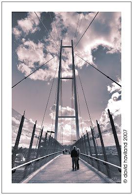 (Note this image is for sale here: http://www.redbubble.com/works/show/19612)
Today I thought I would give a tutorial in a processing method I use fairly often. This technique is a split toning. A basic description of this would be a duotone image with 1 colour being used for the darker tones only and another tone for the lighter tones only.
(Note this image is for sale here: http://www.redbubble.com/works/show/19612)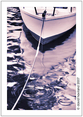 (Note this image is for sale here: http://www.redbubble.com/works/show/19582)
So how do I get this effect, quite simple really if you have even a rudimentary knowledge of photoshop, and I can assure you a rudimentary knowledge is all I have.
To begin with I transform my image into a black and white image with the tones/contrast that I want. Next I create a hue saturation layer, the 2 colours I believe work best are blue and red as in the mid tones where they blend they form a nice purple colour.
This next image shows the result after the first hue saturation layer has been applied. You have to make sure the colourize box is checked and then just pick a colour and saturation that you think suits, as this is done as an adjustment layer you don't have to worry too much about getting the precise colour yet as you can come back and make adjustments later
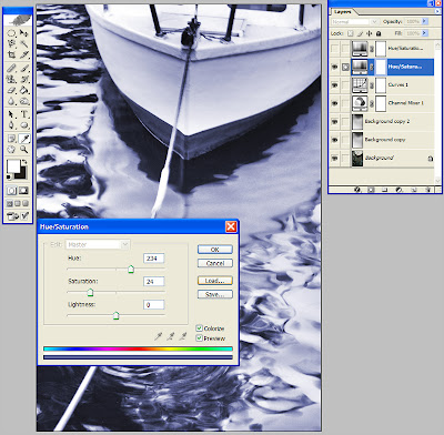
Next you create your second hue/saturation layer above the previous one with the second colour you want.
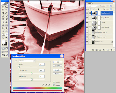
Now this is when the magic happens, by double clicking on the blue section next to the title hue/saturation in the layers palette, you will bring up the layers style box, make sure you do this on the top layer of the two.
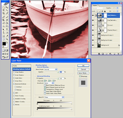
Down the bottom of the box you will notice to 2 gradient bars, these bars are used to determine how much of the current layer is blended. The top bar is used for keeping, rejecting tones in the current layer, the bottom layer is used for keeping/rejecting tones based on the tones in the layer below, for this procedure I use the bottom one.
You will notice markers at either end, these slide inwards, by sliding the black one to the right you are saying do not show anything on the current layer that is darker then the point it's at. It is hard to see but if you look carefully you will see that there is a line down the middle of the slider, this is because the slider can be split into two.
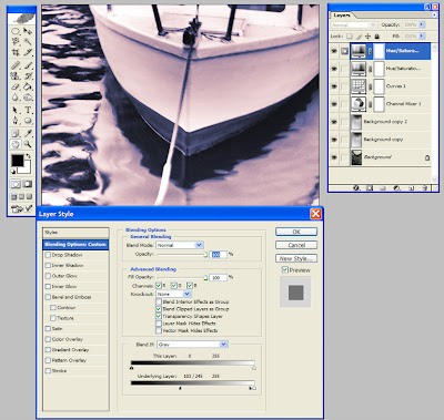
You may be asking why we would want to do that, by splitting the slider in two and moving the right hand side (in the case of the darker slider) towards the right we make the blend between the two tones a lot smoother and gives a blend between the two layers, in the case of red and blue it forms some nice purple shades. Anyway here is a shot showing the adjustment in this image.
You will notice markers at either end, these slide inwards, by sliding the black one to the right you are saying do not show anything on the current layer that is darker then the point it's at. It is hard to see but if you look carefully you will see that there is a line down the middle of the slider, this is because the slider can be split into two.
You may be asking why we would want to do that, by splitting the slider in two and moving the right hand side (in the case of the darker slider) towards the right we make the blend between the two tones a lot smoother and gives a blend between the two layers, in the case of red and blue it forms some nice purple shades. Anyway here is a shot showing the adjustment in this image.
Next is just fine tuning until you have the image the way you want. I hope you have found this interesting and informative and if you have any questions about this technique please contact me via my blog as linked above.
-------------------------------------------------------------
Many thanks David for your submission.
Cheers
Russell
My Gallery: http://www.pixelpix.com.au/gallery
Australian Digital Photo Of The Day: http://www.potd.com.au
Photography help for beginners - Film & Digital Camera Techniques - Post Processing - Photography tips and tricks - Split Toning

